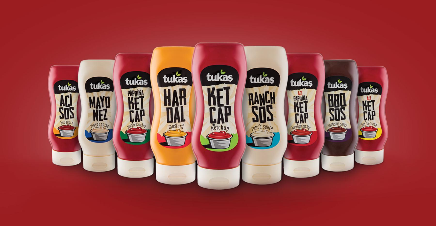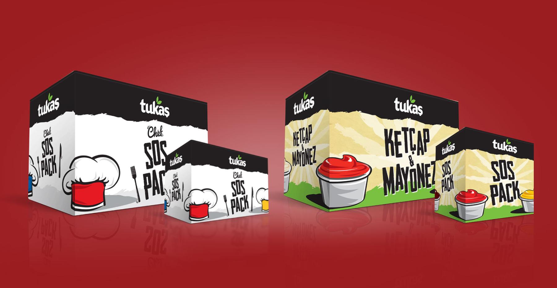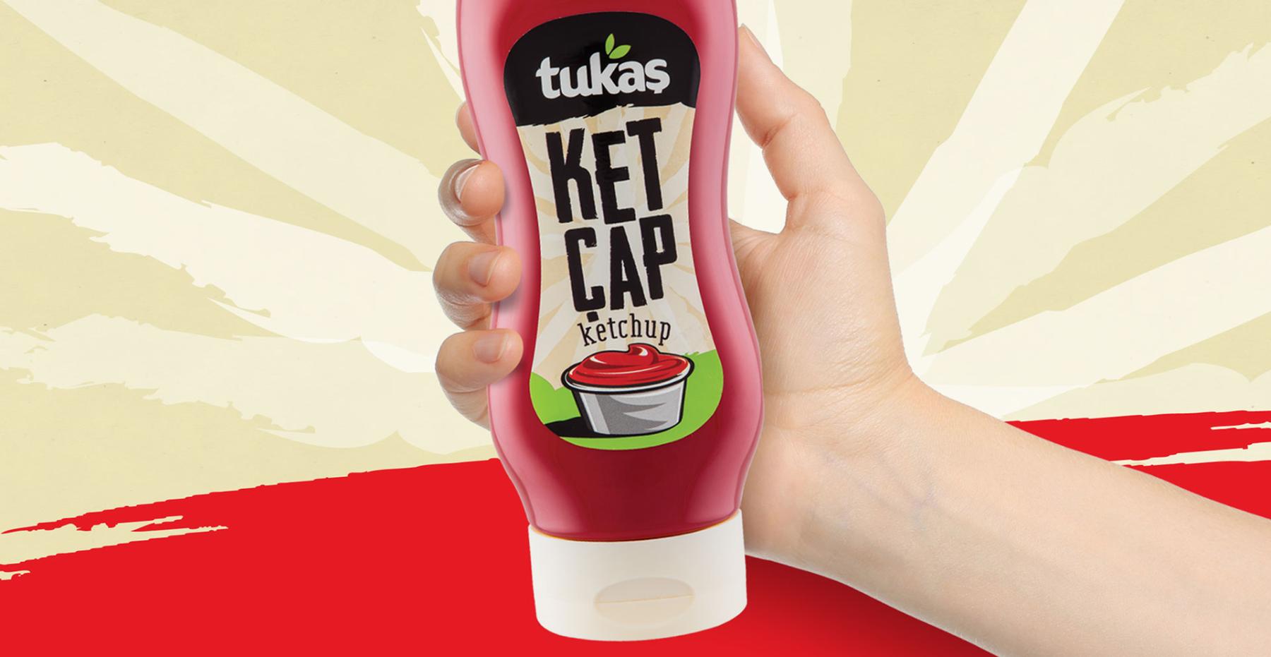
The packaging design developed for Tukaş’s new sauce category—covering ketchup, mayonnaise, and specialty sauces—highlights the brand’s young, dynamic, and playful character. Designed for everyday ease of use, this new format adds flavor to the table not only through its contents, but also through its packaging language.
Branding Through a Unified Series Language: A cohesive series design was created under a single visual system for ketchup, mayonnaise, mustard, and other sauce varieties—allowing each product to express its own character while maintaining a strong family identity.
Instant Recognition: To help consumers quickly identify the product they are looking for on shelf, a clear color-coding system and distinctive iconography were implemented.
Modern & Playful Typography: High-energy, eye-catching typography was used to bring product names to the forefront and reinforce the brand’s lively tone.
Emphasis on Practicality: The ergonomic form—communicating “squeeze, close, store” convenience—was supported and amplified through packaging graphics.
Considering the highly competitive and crowded nature of the sauce category, the design process focused on creating a fun, familiar, and memorable packaging identity. Each product was represented through colors and typography that directly communicate its flavor and aroma, while a holistic visual world was built to preserve a strong family look across the range.
The Tukaş Squeeze Sauce Series delivers a fun and functional packaging experience that aligns with the brand’s rejuvenation strategy and stands out on shelf. Beyond showcasing the product itself, the designs successfully convey ease of use and Tukaş’s friendly brand tone—creating a distinctive and engaging category presence.


